 Rather than trying to simplify my existing design, I instead decided to start fresh, taking some influence from the shape of my original Falcon, but making it simpler to begin with. Using the pen tool in Illustrator, I drew a simple falcon emblem, utilising just the wings and the head and without including any detail within it. I experimented with the shape, eventually arriving at this point, where I chose to use the design with the point at the bottom, as I think this one looks stronger, and creates a nicer shape overall. I really like this design, and already I think it is much more successful as a logo, as I will be able to scale it up and down to any size and it will not lose its impact.
After finalising the outline, I started to experiment with adding colour, using a similar red to that of the existing logo. I chose to make the outline of the logo white, as I think this stands out more, and is much more eye-catching than the black. I think it also helps the logo to sit on the page better, as the white blends with the white background. I think this logo and its shape could easily be used as a badge or a pin, as its simple design and its strong layout would be very successful as one. I feel that this also has some strong military connotations, with similarities to the style of many pins and badges used in the US army/airforce etc. that feature birds of prey; usually Eagles. This helps my design relate also to the US Airforce nose art that I researched, and I think the military similarities help to strengthen my design further, making for a solid, impactful logo.
 I wanted to experiment with my design slightly more, and see if there was anything I could add or change to make it better. It was also pointed out to me during discussions with tutors that with the point at the bottom, the design could look like one big open mouth, rather than a beak and just a decorative point. To fix that issue I tried adding eyes and a line to show the beak. I experimented with different styles of eyes, using more detailed ones and also very simple ones. I also decided to experiment with adding text to the design, placing white text inside the logo, using it as a frame. I eventually came to four different design solutions, including my original blank logo. I really like these designs and I think they are all strong in their own respects, however I decided to seek some extra feedback and opinions.
To do this I printed a sheet of my four designs, in three different colour ways, and asked fellow students to mark which design they preferred and which they thought was the strongest. The one design that came out as the most popular was the one with the simple eye, which personally I also prefer against the more detailed eye. I think the small addition of the Falcon’s features help the design, reenforcing what the logo actually is, whilst still keeping minimal and strong. In discussions with students many thought that the text within the logo was not working, which is something I think I could easily work around, although the text may not be needed at all. This feedback was very helpful, as it gave me some other people perspectives and allowed me to see which design would have the most impact on someone who isn’t necessarily knowledgable about the subject; and hasn’t been staring at the same designs throughout the whole project as I have.
After finalising the design for the Falcon logo, I moved on to creating one for the Dragon craft, aiming to utilise the same style and technique. Again I started by creating a very simple outline of a dragon’s head and wings, using a similar composition as before to help link the logos together more successfully. After getting an outline that I liked I started adding colour by creating another layer behind the outline with the same shape. I started using a similar purple to the one that is used at the moment by SpaceX. However I am not keen on this colour; I don’t think it is appealing and it doesn’t seem to link in any way to the idea of a Dragon, or to space travel in any way. Therefore I will likely change the colour before I finish the design. I found this design a lot more challenging than the Falcon, as a Dragon is a much larger and much more complex creature. After finalising the initial design, I felt I needed to tweak it as there were some parts that weren’t as strong as they could be. I started by isolating the Dragon’s head and scaling it down slightly, as well as bringing it further away from the wings. This has created a bit more space between it and the rest of the design, which I think has made it stronger as it looks much less cramped and awkward than it did. I also decided touching the colour to red as whilst the existing Falcon is red and the Dragon blue, I think red seems like a much more fitting colour for the Dragon. Personally, I associate Dragons to the colour red due to connotations of fire and anger. I also understand that using this red could have connotations to things like the Welsh flag/George and the Dragon, and so I am going to experiment with this colour and maybe use a different shade of red that will hopefully remove this idea from the design.
 There was still something I needed to tweak with my design and I think it came down to the shape of the Dragon and how short the wings seemed. I decided to add more to the wings, extending them further to create a wider design, I think this has improved the design massively, making it stronger and more similar to the size and shape of the Falcon logo. Doing this has also made the wings look bigger against the Dragon’s head, making it look a lot more in proportion now as well, as previously I think the head was slightly too big against the wings. I have also changed the colour slightly, choosing a darker shade of red. I think this works well and I think it also helps to remove any connotations towards the Welsh flag or anything similar that I want to avoid.
After finalising these small changes and tweaking and small errors, I have come to these two outcomes as my final designs. As well as making the Dragon red, I decided to change the Falcon to a light blue, contrasting with the opposite logo. I am also loosely keeping with the original colour scheme of SpaceX, however I did not like the purple they use at all, and I think this pale blue is much more appealing and works to make a much stronger logo. I think that both logos work well together, as they are of similar design and are easily recognisable as being related, which fulfils my original proposal. One of the main issues I had with the original SpaceX designs was that the two logos appeared very separate and didn’t appear to link very well; and so I wanted to work on this especially to create logos that linked successfully and were obviously part of the same brand. I think I have achieved this in my designs as they both compliment each other and they work just as successfully together as they do individually. I am happy with these designs; I think they are very strong logos and the I think the minimal approach I have taken helps with this. They relate to my research into badges and pins whereby I think both designs could be used as pins, which could be an example of a promotional item for the company. They also relate to the idea of WWII nose art on US planes, where their shape could have some military connotations.
With these finished logos, I decided to try mocking them up again onto images of the SpaceX crafts to see how well they worked. Immediately I think they are much more successful than the first logos I experimented with. Neither logo has lost any of its impact when shrunk down to fit onto the images, and I think at real life size, where they would be much much larger, I think they would still look just as strong and still have the same impact on the audience as they do on paper. As well as being strong individually and together, mocking them up alongside my SpaceX brand logo has shown that they also compliment this very well. The pale blue of the Falcon emblem, very similar to that in the SpaceX logo, sits very well on the rocket and I think looks even stronger, with both logos complimenting each other. Overall I think these designs are much stronger than the existing SpaceX logos, not only because they are stronger individually and appear to have had much more thought put into them, but also because they are successful together and work with each other, rather than appearing totally separate and not having any real links between them.


")


 After deciding on a new design, I started making it. I took the same rocket vector that I had made in my previous illustration as I could still use this in my new design after scaling it down. I then added in the night sky using the same process as before. Already scaling the rcket down has helped I think, as it sits better against the sky at a smaller scale as well. My next step was to start creating the scenery, so I began with the trees. I wanted to include layers of trees running from the foreground all the way back into the image. This helps to add depth tothe poster, and also works with the scale of the rocket, as it places it into the background, rather than just appearing as a very small rocket. I wanted my tree vectors to be as accurate and well designed as possible as these would be the biggest, most forward placed object in the poster, and so I found an example of a tree vector that I could trace in Illustrator, to make my own vector for the poster.


 As a final addition to the I wanted to add in some kind of tagline to the image, reenforcing the idea that the poster is a promotional piece, designed to advertise and represent SpaceX as an innovative and unique brand. As I wasn’t sure what I could use, I took to the SpaceX twitter account to look for inspiration and found an excerpt from the bio that I really liked: ‘The Future of Space Travel’. I love the sound of this and I think it is perfect as a tagline to represent the company as an innovative and pioneering.


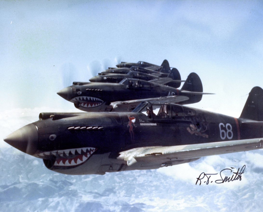 When looking at illustration examples and thinking about how I wanted to create my logos for the SpaceX crafts, I also kept in mind that these logos would be printed onto the side of the crafts, on a very large scale. This brought to mind the idea of US World War II planes, and the nose art that was often painted onto them. Although these planes were used for war, rather than space travel; the idea and the thought is very similar. These paintings were made to raise spirits, and to mark individuality. It was a mark of personalisation, for pilots to make the plane their own, and make something recognisable that others would know them by, which is essentially the point of a brand logo.


")


