Letterhead

Screen Shot 2015-10-21 at 14.26.53
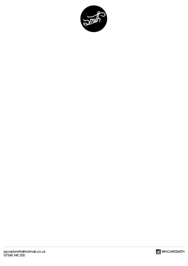
Finally I needed to produce a letterhead for my brand. I wanted to keep this very minimal, as I’ve never thought that letterheads need too much detail, only the bare essentials. I firstly places my black logo at the top of my page in the centre. I liked the way the logo looked sat on its own at the top, and so I didn’t want to crowd it with other details so I placed everything else at the bottom. I divided the page from the contact details with a very thin line, and placed the same details included on my business card. When sent as a letter it would include my own address at the top also, but for the purpose of presenting the design I wanted to keep it plain, show the bare, original layout.

Screen Shot 2015-10-21 at 14.32.41
After printing the letterhead to see how it looked, I felt that the details at the bottom of the page looked too heavy and overpowering, and so I turned the opacity down to 80%, making them more grey and knocking them back slightly so that they didn’t stand out too much and overpower the design. This is a very simple, minimal design and I think it is very successful. Personally I don’t think a letterhead needs to have too much detail and I think it works well like this, keeping with the simple design of the rest of the brand. However I feel including the logo at the top still allows the design to convey the ideas about my brand that I want it to.

Business Card

Screen Shot 2015-10-21 at 13.57.16

After finalising my logo, my next step was to create a business card. I started by putting together a range of different ideas, experimenting with images and placing my logo against different backgrounds. I also wanted to finalise the reverse to my business card first. I decided to make it quite simple and minimal because the front would be busy and interesting so the reverse didn’t necessarily need to be. I also think that my branding is quite simple and minimal, and so I think the contact details on the reverse should be as well. I kept the background white and included my contact details, using Helvetica Nueue, a typeface that I have used repeatedly in the majority of my previous work. I also decided to include my design/illustration Instagram, as this is somewhere I wanted to post all of my work, and so I decided to tie this in with my personal branding, letting it become somewhere that my brand evolves and grows over time as I continue to post work to it.

Screen Shot 2015-10-21 at 13.57.07

After creating a range of designs, I wanted to get some feedback and opinions from other people that may not be familiar with what I had been doing, and so I printed my designs and passed them around people on my course asking them to vote for ones that they liked best. This gave me some impartial advice and an outside perspective, as the people that I will be giving these cards to will most likely not be familiar with my work and so this new perspective would be very useful.

Photo 21-10-2015
After passing my designs around, I found that there were a few designs that came out as slightly more popular, although overall the vote were quite evenly spread out. Whilst this doesn’t help me to chose an obvious favourite, it does also mean that they are all quite well received and it gave me a little more freedom with the options I chose.
Screen Shot 2015-11-01 at 18.46.53
In the end I chose to use two designs for my business card. The first, a simple design with my logo inside a back circle. I was torn between this and the black logo on a white circle, however I thought that this was stronger and I think it presents my logo in a more approachable, interesting way. I decided that this would be my permanent business card, and then I would also have a temporary, more exciting card that could change through time, perhaps with limited runs that are only printed once. For this example, I included one of my favourite film images, with my logo placed smaller in the bottom corner. I really like this design as it shows off my photography more, making it more clear. I also think the logo is clearer in this design as it is placed over a dark area of the image, allowing it to stand out more. I think these are two of my strongest designs from the collection and I think they successfully show off my brand, keeping with the style and the ideas that I want to convey. I would be happy handing these cards out to potential clients, which hopefully means that they will be successful in the real world.

Final Logo

2
This is my final logo design. I really like the white text in a black background and I like the way the circle frames the text. I think this is a very strong design and I think it creates a good image for my brand. I feel it encompasses the way I work and the things that I do. I am happy with my design and although I will most likely edit it and redesign it over time, I think it is very strong and I think I’ve made a successful brand design. I have also experimented with my film photography, integrating my logo with it by overlaying it. I really like the way these have come out. I think the film images work very well with the logo and I think the hand drawn look lends to this. I think these pieces are strong and I’m glad they work so successfully with the logo. I think this now represents more of what I do as a designer, and therefore expands my branding and my capabilities that are conveyed through it.
LOGO FILM1 LOGO FILM2 LOGO FILM3

Film Photography

FH000027
Photography is something I’ve always loved doing and I’ve always had an interest in. Recently I was given a 35mm film camera and I have been experimenting with shooting on film. I’ve loved this and I think the outcomes of film photography are so much nicer than digital. I love the colours and grain that come out on film, and I love the idea of not knowing what has been taken until the film is developed. I’ve often included photography in my work, but never film, and so it is something I would like to experiment with. As I am creating a brand for myself and film is something I thoroughly enjoy, I want to experiment with using film photographs in my branding and hopefully making some strong design, and a stronger brand.

Logo Development

After deciding on my final rough design, I scanned the drawing into Illustrator and vectorised it, making the lines smoother and solid, but keeping the hand drawn look that I wanted in my work. I think doing this has made the design look slightly more modern, which I think works well as it is more similar to a lot of my previous work, made before this branding project. I think the uneven lines add to the hand made look that I like so much, and I think it makes for a stronger, more successful design. I used the pen tool to slightly edit some of the points in the vector, evening out some jagged edges and making the whole design look smoother and more flowing.

Screen Shot 2015-10-19 at 14.03.29

After finalising my design, I began experimenting with backgrounds and colour, placing the logo inside coloured circles. I really like this as I think the circles frame the logo nicely. This also provides a solution for if my logo were to be used on a coloured background or image, as I can simply place the logo inside a coloured circle so that it is not lost in the colour behind.

Screen Shot 2015-10-19 at 14.08.33 Screen Shot 2015-10-19 at 14.08.41

One concern I had about my design was the half ‘s’, and that some people may not realise it is an ‘s’, and may mistake it for something else. However I also didn’t want to use a full ‘s’, so I decided to extend the top of the letter only slightly, making it look more like what I wanted but without including the full letter, as I felt this would lose its strength.

Screen Shot 2015-10-19 at 14.16.20

I personally think that extending the ‘S’ slightly has had a big effect on the design, allowing it to be more recognisable as what its supposed to be, but without the whole design losing anything. I have also found that where I haven’t included the full letter, it has created an almost invisible line between the S and the top of the T. I think this actually makes the design stronger as it appears to flow together much better, and I think it brings the whole thing together. Overall I am very happy with my design. I think it is strong and it will work well for my brand identity. I think it encompasses me in the way I want it to, where the hand drawn look is visible, which will push me to include more illustration in my design and to narrow my work down into a more unique, recognisable style.

1924

Screen Shot 2015-11-01 at 17.08.33
One of my favourite designers (among other things) is Christian Watson. Based in Oregon, USA, he is best known for his instagram account, which is where he posts all of his work, and it is beautiful. Throughout all of his work, mostly his photography, it is clear that he loves adventure and the outdoors, and he is a very hard worker. This is all represented in his instagram, and through his brand. He has branded himself with the name 1924, and I think it is very successful. He also works on branding projects for other businesses, many of which have a very illustrative feel to them and are very natural and hand made. I love the ethos that 1924 works with and I love the way he has branded himself and the way he works.
Screen Shot 2015-11-01 at 17.11.53
1924 is a very strong photographer, and often uses film photography in his work. I love his photography and I love the way he integrates it with his design work, especially where he overlays his hand drawn text on the image. This is something I have briefly experimented with before but something I would love to take further. The typography style that Watson uses in his work is beautifully simple, and I think the hand made, rough look that it has makes for some very strong work. 1924 is a huge inspiration for me, and I think is a very successful, powerful brand, and I will definitely take some ideas and inspiration from the work here.


I have included links to the 1924 Instagram account and website. I personally think that he has a beautiful, and incredibly interesting Instagram account, full of stories and amazing work, and I would, without a doubt, recommend checking it out.
https://instagram.com/1924us/
http://www.1924.us

Logo Ideas

Photo 19-10-2015, 12 06 26
My first step in branding myself was to create a logo for myself. Taking inspiration for illustrators and brands like 1924, I wanted a quite natural, hand made look to my logo, as well as the rest of my brand. To make this, I started by sketching out as many rough ideas as I could think of for my logo. I wanted to have quite a simple brand name, and so rather than using something like ‘Jacob Smith Design, I decided to drop my first name and simply use ‘Smith’ as the name of my brand. I like this as a name as it is simple and recognisable, and I also like the idea of Smith being such a common name, although there are no brands simply called Smith, that I’m surprised that it hasn’t been made before.
Photo 19-10-2015, 12 06 31
This was the first of my rough sketches that I really liked as a design and that I thought could work as a logo for my brand. I love the hand drawn look and I know that that is something I want to be quite prominent in my style, where it is something I want to use more in my design.
Photo 19-10-2015, 12 06 39 Photo 19-10-2015, 12 06 43
I started to experiment with some other hand drawn styles, experimenting with banners and serif styles, whilst still using pens to make my design illustrative and hand crafted.


As I was starting to lose speed with my ideas generation, I decided to experiment with a different media, and so I started using a marker and a whiteboard to draw with. The whiteboard’s smooth surface meant that the pen glided across it easily, allowing me to draw flowing, smooth lines, and to create more smooth hand drawn logo ideas. As I drew on the board I could see one prominent idea appearing, using a small, half ‘s’ and a large, decorative line to cross the ‘t’. I think using the whiteboard to make ideas was successful and allowed me to narrow my ideas down into something that I think could work very well, and looks almost like a signature for the brand.
Photo 19-10-2015, 12 06 52
After refining my idea slightly on a whiteboard, I went back to my sketchbook and began redrawing my refined idea over and over, playing with different styles and looks of the same idea until I had a version that I liked. I feel this divergent thinking exercise has been very useful and has helped me to make a very strong logo idea that I don’t think I would have found otherwise.
Photo 19-10-2015, 12 07 02
This is my final rough idea. This version is one that I quickly sketched out, as if I had quickly written a signature for something. I really like that idea, as I think it enhances the hand drawn effect of it, and it also backs up the illustrative style that I want to use in my work. I think this is the strongest, smoothest drawing that I have made and I think that it could make for a very strong, recognisable logo for my brand.

Self Branding

SMITH
The second part of this branding brief involves creating a brand for myself as a designer. This is something that I have been thinking about already and something I have wanted to work on for a while, and so I am quite excited about this brief and keen to work on it. Throughout this brief I want to try and bring my designs closer together, making more of a unique style for myself and creating a recognisable brand that represents my work and the style of design I make. I also want to include more illustration in my work, and make illustration a bigger focus of my work, as it is something that I enjoy doing and that I really want to incorporate more in my work.