Dungeness

As one final bomb project, we were tasked with visiting Dungeness, a okay known for its baron wasteland-esque nature. The whole brief is revolved around getting outside in nature and experiencing the outdoors, which is something I love to do as much as I can anyway so I was quite excited to go to Dungeness.

From driving down and getting to the beach, my first impressions were more amazement than anything else. I had been told many times about how baron and empty it was, but I don’t think I was quite prepared for how empty it really was. There is nothing there. After driving along a weirdly straight, flat road in the middle of noting but pebbles, we eventually parked up and got out to have a wander. The thing that struck me as the weirdest was the amount of little houses that look like they have just popped up out of nowhere; they almost look out of place against the environment. The other thing I noticed was the amount of debris and old fishing junk just lying around; it was almost reminiscent of Hastings beach, but without the bustling town behind it, there was just nothing.

I had also been told about the power plant, and about the stark contrast between the man made of the plant and the baron expanse of nature surrounding it. Whilst it was quite a contrast between the two, with the power plant sitting and looming in the distance, I wasn’t actually that surprised by it. Growing up around more built up areas it was almost a little comforting in some ways to see the power plant, weird as that may sound. The thing that I found weirdest about Dungeness was still the emptiness of the place; just nothing for miles other than a few, out of place houses dotted around almost randomly. It was however, a very beautiful place and I found the whole experience of walking along the front very peaceful and extremely interesting. As with whenever I go outside, it was calming to be out in nature and experiencing the outdoors, and it was fun to have a little adventure in the empty wasteland that sits down on the coast there.
This slideshow requires JavaScript.

Initial Logo Ideas

After researching into the design and branding behind various custom shops, and looking into typography, I started to brainstorm inspirations and ideas, and then sketch out a few different designs that I had been thinking about for potential logos. There is a fairly varied range of ideas here, and I think some are stronger than others. From this point on I am going to experiment with a few different ideas that I like most and take them forward digitally, trying out different techniques and styles, developing them until I have a design that I like, and can be used as a final logo.

Initial Ideas

photo-06-03-2017-09-08-15At this point, I felt I had gathered enough research and generated enough ideas to start thinking about creating a final piece. As well as creating a homepage for the game, I wanted to also look at designing a trailer/video for the game, based on the ideas that I have looked at and also in the format of a 360 video, as I feel that this would be a much more engaging way to approach the trailer, and I think it would work very well for the idea of telling the story of a tank, from blueprint all the way through to the battlefield, which is the story I want to tell in my trailer.

First Thoughts (Group Work)

After the trip to the factory, we were split into groups with myself, and another student who visited the factory, as team leaders, tasked to feed back our experiences to the other students who didn’t go. In these groups we were tasked with coming up with a theme or message that we could potentially market to our client. We started the day with some simple divergent thinking tasks to get to know our group and to boost creativity, such as illustrating as many emotions we could think of that could be related to the thought of wasting fruit.

Eventually we began to discuss and brainstorm some ideas that we were having. Some of these included:

  • Illustrating the value of the fruit through morals and responsibility, rather than costs and expenses
  • Illustrating the long process that the fruit has gone through already before reaching the factory
  • Suggestion boxes for improvements in the factory from staff points of view
  • Portraying the fruit as a precious and beautiful object; something to be handled with care and compassion
  • Potential reward schemes, for example any money saved from wasting less being put back into the staff
  • Highlighting the importance of the workers; showing that they are the last step in this long process to make them feel more involved and part of a team
  • Weekly/monthly newsletter or postcard that could be given to workers to show how much has been wasted/saved in the month; compared to last month and with possible goals for wasting less in the coming month15300515_10211065566492891_1217768832_n

After discussions between our group there were a few ideas that stood out to us all as being more successful and interesting, and something we all liked the idea of working on. the main theme that seemed to stand out to us was the idea of the journey, and illustrating that long process to show how far the fruit has come, and how much effort has been out in to getting this fruit to the factory. We thought that taking this approach would be successful in encouraging the workers to waste less, and also to be conscious of how much they are wasting, whereby showing them the long process would help to make them feel more responsible for protecting this fruit. We wanted to make the staff feel involved and responsible for getting this fruit to the customer, showing them that they are the very last step in a very long process, and for them to waste something that has come such a long way is something that can’t happen.

We felt that we needed to have a slogan to run alongside our idea, and to tie everything together, making it feel more like a campaign that could continue to run. And so after discussing a few between us that could be used, a member of the group suggested ‘Haste, Not Waste’. This was the most successful one, as we felt the simplicity and the rhyme of it worked well and would be strong. It is short as well which makes it easier to get stuck in someones head from even a quick glance. Being short and simple, it could also be easily translated into other languages spoken by the staff members in the factory, for the purpose of posters of any printed material.

After refining our idea, we moved on to start thinking about how we could convey it and what techniques and formats we could use. In our discussions we agreed that we wanted to keep the feel of the idea quite lighthearted and uplifting, aiming to keep the mood in the factory higher rather than lower. As a way to show our theme in a fun and slightly more interactive way than simply making a poster, we decided that we could utilise the out of use TV screens that were dotted about in the factory by making a simple animation. This piece could work with or without sound, could be played in intervals or on repeat, and could be a nice piece to show to new staff as well as having on in the background of the factory as a subtle reminder to keep conscious of waste.15281882_10211065566652895_1887438041_nWe moved on to draft up a simple storyboard for our animation. The story would show the fruit being planted in a warm country, and then taking months to grow (hence the calendar sketch). After months passing the fruit would be fully grown and hop off of the tree, beginning its long journey around the world. Upon finally reaching the factory, we would show the fruit on a conveyor, about to fall to its ‘death’ and be wasted, before being caught by a responsible and heroic staff member, saving the fruit and reducing waste.

We wanted to use a quite simple style and bright colour scheme, to keep the animation light hearted and uplifting, whilst containing some quite deep and meaningful themes. We also chose to work with a pomegranate to begin with, as this was the story that personally stuck with me the most and was one of the fruits that took the longest to grow. This animation of course could and would be made with other fruits. An animation could be made alongside this for a number of fruits prepared at the factory to run as a series that they use, for fruits like bananas, mangos, melons, apples and even strawberries that, in summer, are grown right next to the PW factory.

My Group:
Will Merritt
Laura Tooth
Sam Byiers
Nicole Broad
Emily Wickens
James Court
Sarah Bond

Prevent: Day 1

victvs-preventing-terrorism-thum

Prevent is a government run campaign with the aim of preventing radicalisation across the country, and preventing terrorism as a whole. Above is the primary poster that is used by the government and is posted around West Kent College, aimed at the students here.

As we have learnt upon starting this year, the pressure on preventing radicalisation has dramatically increased and it is now mandatory that teachers have training on the subject and that students are aware of this. As design students, we were presented with a surprise brief in relation to this. West Kent College are aware that the poster is poorly designed and is not as impacting as it should be. And so we were tasked, in year groups, to redesign the prevent campaign in a way we thought would be much more successful, with the winning year groups design being used throughout the college.

We started the day with a divergent thinking task looking at images of objects like an engagement ring or an ice skate, and spending a short amount of time thinking up as many improvements to each as we could. This was a quick task to get us into a more creative, open state of mind, before which we moved on to looking at the prevent poster itself.

Rather than thinking of immediate improvements for this poster, we used a method proposed by Edward De Bona called PMI (Plus, Minus, Interesting), in which we had to pick out points that we thought were good, things we would take away, and points of interest in the design.

Plus: I thought the slogan was quite clever, and could have been very successful if it were executed better.

Minus: The first thing I would have taken away was the colour; I think it is quite a sickly green and does not have any strong connection to the message of the poster. I also don’t really like the style of the illustration. Personally I am not keen on the idea of the pill in the first place as I don’t think it is very clearly related to the message, but I think if that is the concept then it could have been executed better, with stronger imagery.

Interesting: Even though I did not like the illustration style, I thought the idea of using an illustration was quite interesting. I also found the thought behind the concept quite interesting, as the aim seems to be to prevent radicalisation before it even starts to happen, hence the ‘Prevent’ campaign.

Following this, we moved on to work on another divergent thinking task, in which we had to come up with as many ideas as we could for methods of non-violent, non-aggressive protest. For this task to be successful we were to think creatively and be as imaginative as possible, even if it was unlikely and unusual. Some of our ideas included marches, sit ins, themed social media profile pictures, demonstrations and public art.

screen-shot-2016-10-10-at-13-54-08

Our final task for the day was to research into radicalisation and how teachers are educated about it by completing the governments online education programme. This offered advice and tasks, getting you to think about how radicalisation works and the little things that might be signs of someone being radicalised.

I did think throughout this process that, almost all of the little signs of radicalisation could be, and more likely would be, signs of other, more common issues such as depression, anxiety or home life issues. However as I worked through the programme I found that it did address this and explain that, whilst these signs (like distance from friendships, short tempers or mood swings) can be due to radicalisation, it more often than not wouldn’t be as these other issues are far more common.

Logo Ideas

Photo 19-10-2015, 12 06 26
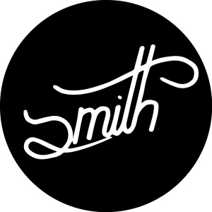
My first step in branding myself was to create a logo for myself. Taking inspiration for illustrators and brands like 1924, I wanted a quite natural, hand made look to my logo, as well as the rest of my brand. To make this, I started by sketching out as many rough ideas as I could think of for my logo. I wanted to have quite a simple brand name, and so rather than using something like ‘Jacob Smith Design, I decided to drop my first name and simply use ‘Smith’ as the name of my brand. I like this as a name as it is simple and recognisable, and I also like the idea of Smith being such a common name, although there are no brands simply called Smith, that I’m surprised that it hasn’t been made before.
Photo 19-10-2015, 12 06 31
This was the first of my rough sketches that I really liked as a design and that I thought could work as a logo for my brand. I love the hand drawn look and I know that that is something I want to be quite prominent in my style, where it is something I want to use more in my design.
Photo 19-10-2015, 12 06 39 Photo 19-10-2015, 12 06 43
I started to experiment with some other hand drawn styles, experimenting with banners and serif styles, whilst still using pens to make my design illustrative and hand crafted.


As I was starting to lose speed with my ideas generation, I decided to experiment with a different media, and so I started using a marker and a whiteboard to draw with. The whiteboard’s smooth surface meant that the pen glided across it easily, allowing me to draw flowing, smooth lines, and to create more smooth hand drawn logo ideas. As I drew on the board I could see one prominent idea appearing, using a small, half ‘s’ and a large, decorative line to cross the ‘t’. I think using the whiteboard to make ideas was successful and allowed me to narrow my ideas down into something that I think could work very well, and looks almost like a signature for the brand.
Photo 19-10-2015, 12 06 52
After refining my idea slightly on a whiteboard, I went back to my sketchbook and began redrawing my refined idea over and over, playing with different styles and looks of the same idea until I had a version that I liked. I feel this divergent thinking exercise has been very useful and has helped me to make a very strong logo idea that I don’t think I would have found otherwise.
Photo 19-10-2015, 12 07 02
This is my final rough idea. This version is one that I quickly sketched out, as if I had quickly written a signature for something. I really like that idea, as I think it enhances the hand drawn effect of it, and it also backs up the illustrative style that I want to use in my work. I think this is the strongest, smoothest drawing that I have made and I think that it could make for a very strong, recognisable logo for my brand.

Self Branding

SMITH
The second part of this branding brief involves creating a brand for myself as a designer. This is something that I have been thinking about already and something I have wanted to work on for a while, and so I am quite excited about this brief and keen to work on it. Throughout this brief I want to try and bring my designs closer together, making more of a unique style for myself and creating a recognisable brand that represents my work and the style of design I make. I also want to include more illustration in my work, and make illustration a bigger focus of my work, as it is something that I enjoy doing and that I really want to incorporate more in my work.

Listen to Something Different

For this creative piece we were told to listen to something different. Each of us picked two tracks, one easy to listen to and one more difficult to hear. These were then given to someone else to listen to, so that they could hear something different. The two tracks I chose were ones that I really liked. The easy listening was Astronomyy-Nothin On My Mind (which you might notice is the artist I went to see in my Colour & Shadow post) and the difficult one was Being As An Ocean-The Hardest Part Is Forgetting Those You Swore You Would Never Forget.

This is the easy listening track I was given. Straight away I recognised the underlying beat and melody from the original track by Dr. Dre. I really like this version of the song. I found that the vocals and subtle effects that have been added to this version give it a completely different feel. The steady beat and calm vocals and effects create a very chilled sound, and a track that is very easy to listen to. Personally, I don’t find that its something I could listen to and get really into as it is very repetitive, but for something to have playing in the background whilst you work, its perfect.

For the music that is difficult to listen to I was given this piece. Personally, I listen to a huge range of music, some very harsh, and I didn’t find this very difficult to listen to, although I can understand how some might find that. There are some quite harsh tones and sounds and pounding drums that repeat all through the song. The vocals also could be quite hard to listen to. The grime rap style is very fast paced and not necassarily a pleasing sound. I found this track very repetitive and it isn’t the sort of thing I would normally listen to, although I wouldn’t say that i disliked it, but I did prefer the other track.

Colour & Shadow

For this creative task, we were asked to look at colour, shadows, and the colour within them. I took this as a very loose start point, along with the luck that I was attending a concert in the week. I went to see a relatively new indie artist called Astronomyy. Due to how new he is, the gig was held in a very small venue, although I found the lighting to be very exciting, which is something I was hoping for. When going to gigs, I am always interested in the lighting, and how it will be used to make the show more exciting, and also reflect the music being played.

I loved the lighting for this show. All the lights were low down and all behind the band, which silhouetted them really well. The use of a smoke machine also enhanced the light, allowing beams of colour to appear, shining past the band and reflecting off of their equipment. If you listened to the music they play, this lighting helped to set a very fitting mood, accompanying the music brilliantly. I also thought the colours were amazing, lots of blues/purples, contrasted by white/yellow/orange lights that lit up between each other. There was a lot of shadow among the lights, which helped to make the place seem quite dark and calming, even though it was lit up with an abundance of colour and filled with the excitement of live music.